Poliphili Italic
Poliphili, created by taking a model the splendid typeface designed by Francesco da Bologna, called “il Griffo“, for the sumptuous volume of the Hypnerotomachia Poliphili, published in Venice in 1499 by Aldo Manuzio, lacked its italic equivalent, also because, before that year, no one had thought of creating a character with the features of the chancery writing, the writing of the scribes of the chanceries of Italy, slightly compressed and inclined to the right. The first volume ever, with only a few words written in italics, was in fact titled Epistole di santa Caterina, also edited by Manutius in 1499, with the types designed by Francesco.
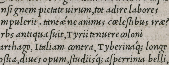
 Three years later, Francesco da Bologna was the first to create an entire cursive alphabet, studying the features of the chancery writing of the Paduan Bartolomeo Sanvito. The new alphabet was used to print the Virgil of 1501, and the Divine Comedy of 1502, in both cases entirely with the new font.
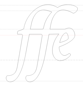
Griffo’s new alphabet was chosen as the ideal model for the Poliphili italics, while trying to adapt it to the needs of use in the context of digital printing: the \s which normally had the lower part far below the curved letters was shortened to respect the design of the other similar letters, just as the \h was endowed with more homogeneous proportions, the \f which had a very inconstant descending trait was interpreted and made uniform between all the ligatures.
And the ligatures between the letters have been completely reported in the digital alphabet, also constituting all the groups of three letters. In addition were drawn all the capital swash glyphs.
The font was finally published on MyFonts in January 2020.
Useful links
griffoggl.com – Francesco Griffo’s italics


