

Poliphili
Finally, I have reconstructed the historical character that accompanies the Hypnerotomachia Poliphili, now available on MyFonts web site.
Hypnerotomachia Poliphili, in English can be translated in “Dreaming Love Fighting of Poliphilus”, is a romance about a mysterious arcane allegory in which the main protagonist, Poliphilo pursues his love, Polia, through a dreamlike landscape. In the last, he is reconciled with her by the “Fountain of Venus”.
The author of the book is anonymous, however, an acrostic formed by the first, elaborately decorated letter in each chapter in the original Italian reads “POLIAM FRATER FRANCISCVS COLVMNA PERAMAVIT”, which means “Brother Francesco Colonna has dearly loved Polia”. Despite this clue, the book has also been attributed to many other authors. The identity of the illustrator is less certain than that of the author.
It was first published in Venice, in December 1499, by Aldo Manutio. This first edition present an elegant and unique page layout, with refined woodcut illustrations in an Early Renaissance style and a refined Roman font, cut by Francesco da Bologna, is a revised version of the type used in 1496 for the De Aetna of Pietro Bembo.

Recostruction of the letter \G from one of the originals
The print quality is very high for the time, but nevertheless it presents many inconsistencies and imperfections due to the non ideal inking and adherence of the matrix to the paper. For that reason numerous samples of the original have been used to create every single glyph which will result in an appropriate reconstruction and not a mere and humble reproduction.
Some letters like \J, \U and \W where extrapolated, because they are not part of the original alphabet of the period. Some letters like \Q, \X, \Y, \Z and \h has been updated to more modern variant, but the original shape is accessible by Stylistic Alternates Opentype Feature, wich changes also the shape of the \V and the \v.
The original numerals \zero, \one, \tree, \four and \six have been accompanied by reconstructions of the missing numbers and extended by modern figures. Finally, swashed lower cases and original scribal abbreviations were also included.
Later the font was joined by a matching Italic variant.

Comparison between original and reconstruction of the lowercase \r
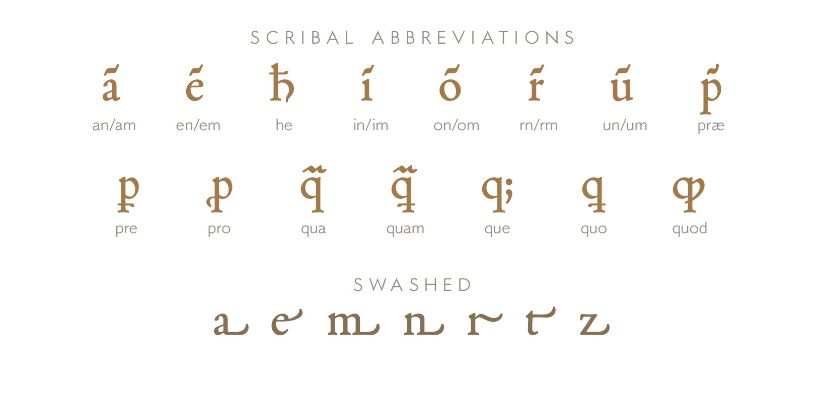
Scribal abbreviations found in the original text and the swashed glyphs.
Useful links
archive.org – digital version, from the Boston Public Library collection at archive.org
rarebookroom.org – digital version, from the Library of Congress at rarebookroom.org
riccardolocco.com – Hypnerotomachia capitals by Riccardo Olocco


