

Olivetti
In 1970 the talented Swiss graphic designer Walter Ballmer was entrusted with the task of defining and therefore standardizing once and for all, the Olivetti logo and the rules for its correct use.
The changes made will totally change the shape of the glyphs that make up the surname of the founder Camillo Olivetti, making them thicker, rounder and lowercase. The result is a friendly and immediate logo, easy to read and to recognize, but at the same time solid and respectable. Since 1971 the logo has been adopted for all protucts and in every context.
Below you can download our interpreted reconstruction of this font, where we have tried to recapture the early 70s taste that distinguishes this design.
Reconstruction of the lowercase letter /e
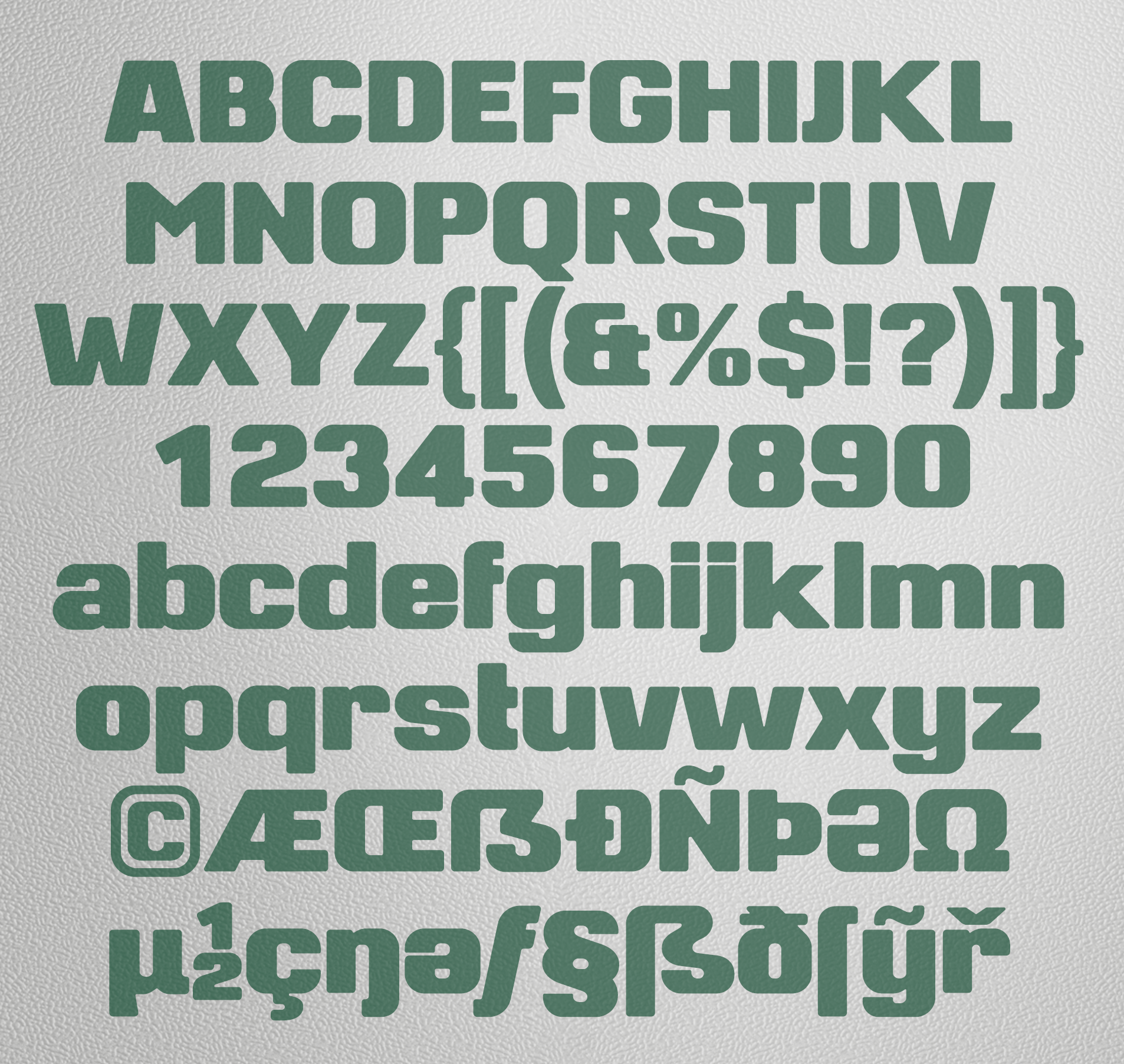
Examples of some of the letters of this alphabet


