

Inkunabula font
The Inkunabula font does not exist. Or rather, there are too many!
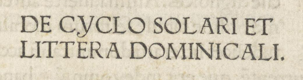
The Inkunabula typeface was “engraved” in 1911 at 14-point size for the Commissione Esecutiva dell’Esposizione Internazionele di Torino (Executive Committee of the 1911 International Exhibition in Turin), by the Augusta Foundry — the name that Nebiolo & Co. had adopted during those years.
As noted in Archivio Tipografico no. 247 (March 31, 1923), this typeface is a faithful reproduction of the design used by Erhard Ratdolt, a printer originally from Augsburg, Germany, who was active in Venice, especially in the production of classical Latin texts. Ratdolt worked in Venice from 1476 to 1486 before returning to Augsburg. From 1475 to 1478, he collaborated with two other German printers: Peter Loslein and Bernhart Maler.
The specific reference for this typeface was the Roman type used in the 1476 edition of the Kalendarium. As the name suggests, the book contains various ephemerides up to the year 1530 and was authored by Regiomontanus, the pseudonym of Johannes Müller of Königsberg (Unfinden, June 6, 1436 – Rome, July 6, 1476), a German mathematician and astronomer. Regiomontanus was one of the earliest writers of astronomical material and produced a series of almanacs so successful that their publication continued even after his death — which occurred in Rome the same year the book was printed, one month after his 40th birthday. The Kalendarium was published in Latin and Italian in 1476 and in German in 1478, using both Roman and Gothic typefaces.
Ratdolt’s typeface and its influences
As mentioned above, the font used by Rardolt is a roman that, although probably influenced by the model of Nicolas Jenson, is closer in style to that of Adam von Ammergau, another German printer. However, it fits perfectly into the styles of the early years of Venetian roman fonts, distinguishing itself, among other things, by the marked inclination of the loops in the curved letters, up to reaching horizontality in letters such as \d and \p.
In the Inkunabula version, the \Y has been updated to the modern upright form, though the archaic glyph is still included among the OTF stylistic alternates.
Example of the original letter \Y
Later, the typeface family was completed in sizes 10 and 18, and eventually in 6, 8, 12, 16, 20, 28, 36, and 48 (the latter only in uppercase). And this brings us back to the initial paradox: the 14-point version differs significantly from the others, which themselves show slight but meaningful variations. Beyond the normal optical size adjustments — such as ascender height, descender length, x-height to capital ratios, contrast between thicks and thins, and glyph width — the differences between the 14-point and all other sizes lie in the very shape of the typeface.
To list just a few of the most evident discrepancies with respect to the later sizes:
- The C, whose lower terminal is more rounded and slanted;
- The O, whose inner contour is oval rather than elliptical;
- The Q, with a completely different tail;
- The c, which — like the 15th-century original — is visibly taller than the average lowercase height;
- The d, where the junction between the bowl and stem is pinched, like an ink trap;
- The i and j, whose dots differ not only in shape but also in position;
- The f, with a vertical upper terminal and a different, lower crossbar;
- The y, with a more proportionate descender;
- The number 8, which leans to the left.
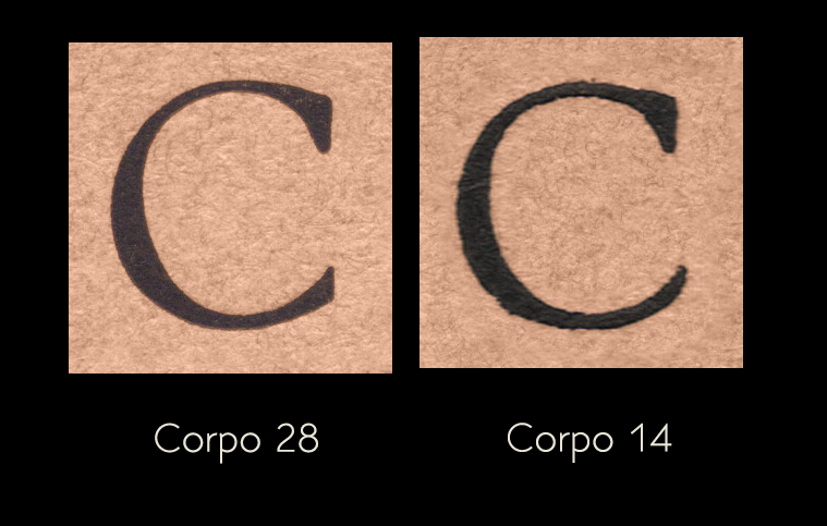
Comparison of the letter \C shapes of body 28 and 14, in particular note the significantly different lower terminal.
And that’s not all: even within the 14-point size itself, variations among the glyphs can be found. A striking example is the \F, which changes shape entirely over time.
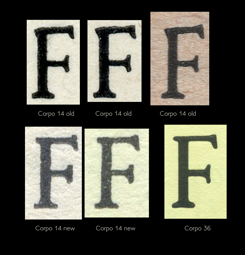
Comparison of the versions of the letter \F: at the top you can see the letter in 14 point in the initial version, at the bottom two updated versions compared with a third in 36 point.
In my opinion, the diversity of forms is one of the main reasons the Inkunabula has lacked a digital edition until now — with the exception of the excellent Inkunabula TX by Claudio Piccinini, based specifically on the 14-point version and, to my knowledge, still in development.
Another reason for the delay, again in my view, lies in how strongly the design reflects its origins: one of the earliest printed type designs. Its archaic charm is also its Achilles’ heel, as the forms lack the harmony, proportions, and optical corrections to which modern readers’ eyes have become accustomed.
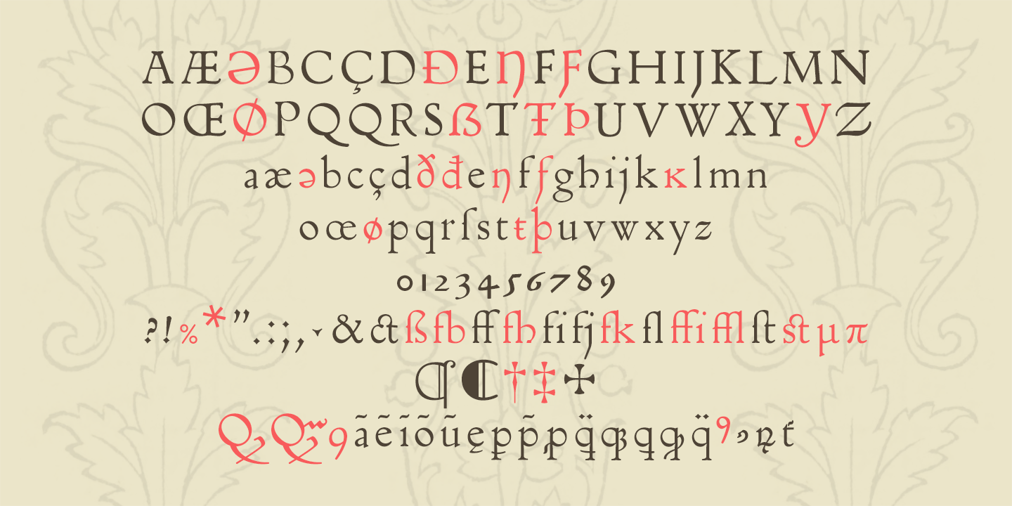
For this reasons, I initially thought not to draw from a single specific size, but rather to create a reinterpretation that would stay as close as possible to the originals while harmonizing the contrasts and dimensions of the various glyphs: Flanker Inkunabula. I aimed to adopt the forms I found most pleasing or most iconic, based on expert memory of the Inkunabula — a design that remains close to the originals while harmonizing glyph proportions and contrasts. The contrasts, overshoots, and heights are now consistent, the weights more uniform throughout the alphabet, and the serifs maintain a more balanced geometry.
Flanker Inkunabula is available on MyFonts.
The Flanker Inkunabula, the dark colored glyphs are the original ones
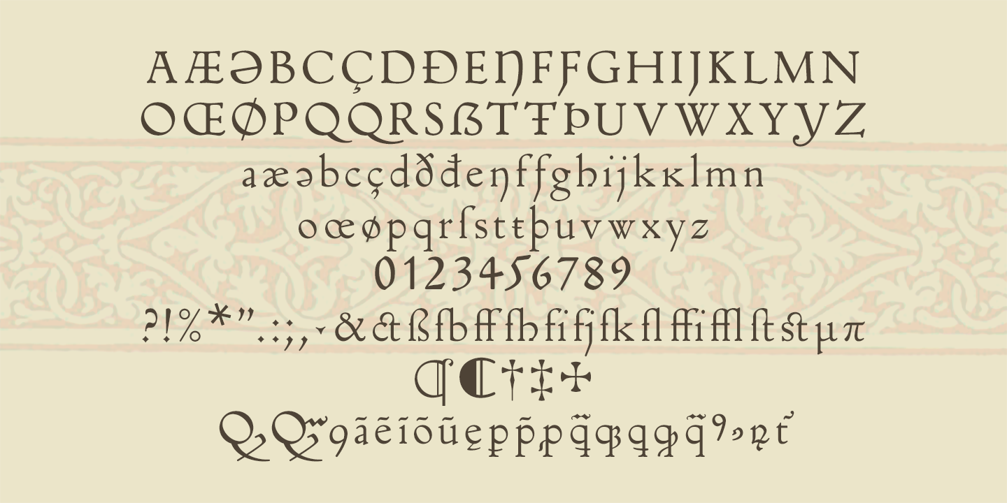
But while I was drawing the new character I didn’t feel satisfied and I understood that it wouldn’t be fair to this alphabet that had been neglected for too long. So I decided to create two more sets: the Inkunabula corpo 14 which actually takes up the original font in 14 points, let’s say at an early stage of design, between 1911 and 1923, and which you can download below.
Inkunabula corpo 14 (size 14)
And Inkunabula Nova, a reimagined version with a more modern and legible approach, which will also be available soon on MyFonts.
Inkunabula Nova
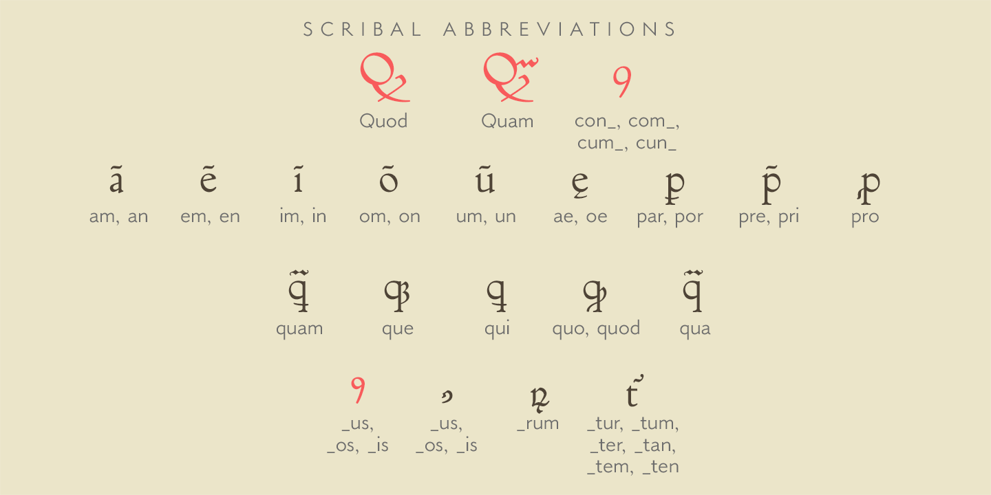
Scribal abbreviations
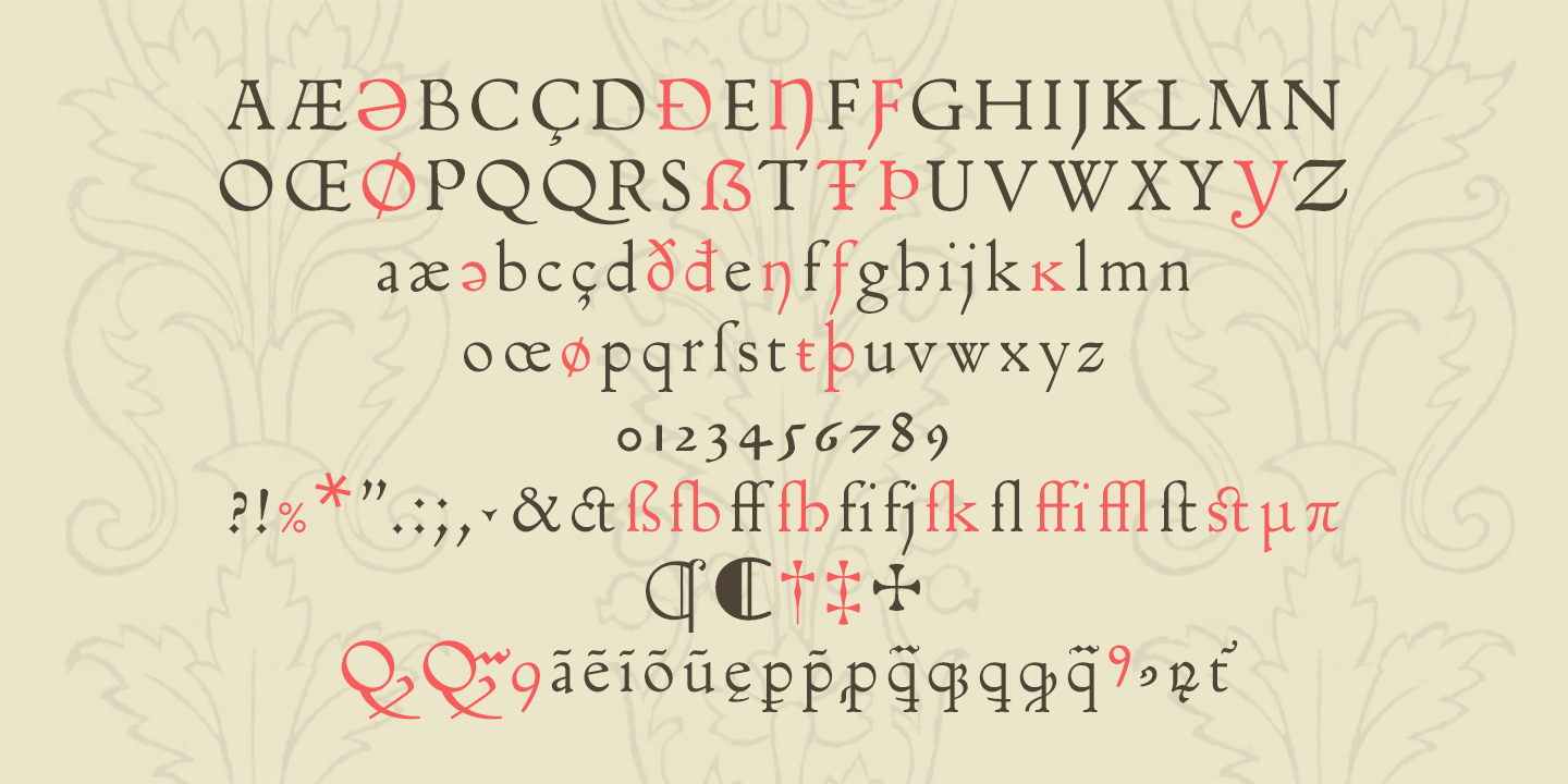
Inkunabula inherited the scribal abbreviations from the 15th-century original. These abbreviations were used in Europe as early as the 3rd century by scribes to conserve writing material. Early printed books continued this practice for the same reason, and also included many ligatures that have since fallen out of use. It’s important to note, however, that the symbols used for abbreviations varied noticeably depending on the geographical region of the text’s origin.
The new typeface by Nebiolo included the characters shown in dark color in the image below, while those marked in red were added for completeness, as they appear in the original text. Interestingly, one of the characters was not found in the Roman-style text but rather within the Gothic-style section: the abbreviation for “-us” at the end of a word. In the Roman text, that abbreviation appears in the form shown in red in the image. Perhaps the decision to introduce a sign from a different script is due to the fact that the Inkunabula series was created for the facsimile reprint of an early edition of De Regimine Sanitatis by Giacomino da Confienza, which specifically required the use of scribal abbreviations.
Final thoughts
Reconstructing the Inkunabula was much more difficult than expected, and this is not so much because it was difficult to find original material to work on, but as I tried to explain above, precisely because it seems that the original Roman was the son of many fathers and did not have a well-defined structure. It was necessary to mediate considerably between the various forms.
Due to the difficulty and complication of the subject, I will remain even more open to the advice and reports that you will have the patience to address to me.
Finally, only in 1926, next to the ornate initials and the filleted initials, the italic script was added, taking a sixteenth-century drawing as a model. But that’s another story…
Inkunabula-corpo-14.zip
File type: application/zip Download size: 47.20 KB Document type: OpenType Font Document version: 1.160 Document licence: Attribution-NoDerivs 3.0 Unported (CC BY-ND 3.0) Date added or updated: 31 May 2025 Download link: https://www.studiodilena.com/wp-content/uploads/2025/05/Inkunabula-corpo-14.zipUseful links
Kalendarium of Regiomontano
- Roman character version, on the website of the Library of Congress of the United States of America.
- Gothic character version, on the archive.org website.
More examples of printed books with Erhard Rardolt’s font
- Monumentum compendiosum pro confessionibus cardinalium reliquorumque praelatorum / Breve scrutatoriolum peccatorum pro confessionibus, Erhard Rardolt, 1476, on the archive.org website.
- Appiano, Historia Romana parte I, Erhard Rardolt, 1477, sul sito archive.org.
- Appiano, Historia Romana part II, Erhard Rardolt, 1477, on the archive.org website.


