Selene
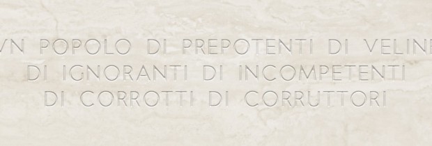
 Published on MyFonts a new grotesque character style: Selene (http://www.myfonts.com/fonts/flanker/selene). It is a minimal character, geometric, with a minimum of optical corrections: uncompromising then. It is suitable both in technical and technological, but also where it is needed a measured elegance. You can see it in action in the titles of this website.
Selene is published in five weight (light, regular, medium, semi bold, bold), each with Italic variant.


