Selene Extra Bold
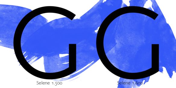
Selene gets a new weight: the extra bold.
Work on the new weight has allowed us to improve the design of this character, who wants to be geometric and minimal, but at the same time neat, elegant and full-bodied.
Additionally have been added all the currency symbols provided by the current Unicode standard.
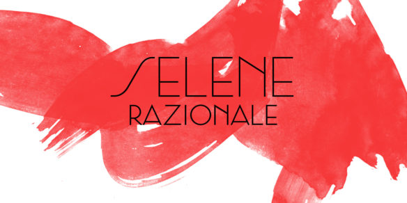
Finally, the set of alternative letters (stylistic set 3) has been completed with accented letters. This stylistic set reproduces the 30’s and 40’s style of the last century. In the future this set will be flanked by several others to make this font really suitable for all situations!


