

Selene Book Font
The new Selene Book typeface takes up the linear, clean although complete in all the froms style of Selene, but introducing three important differences.
The first and most obvious change concerns the lowering of the x-height of the lowercase letters which makes it even more elegant. The shape of the letters has been made closer to a Roman character, note the \b and \g for example.
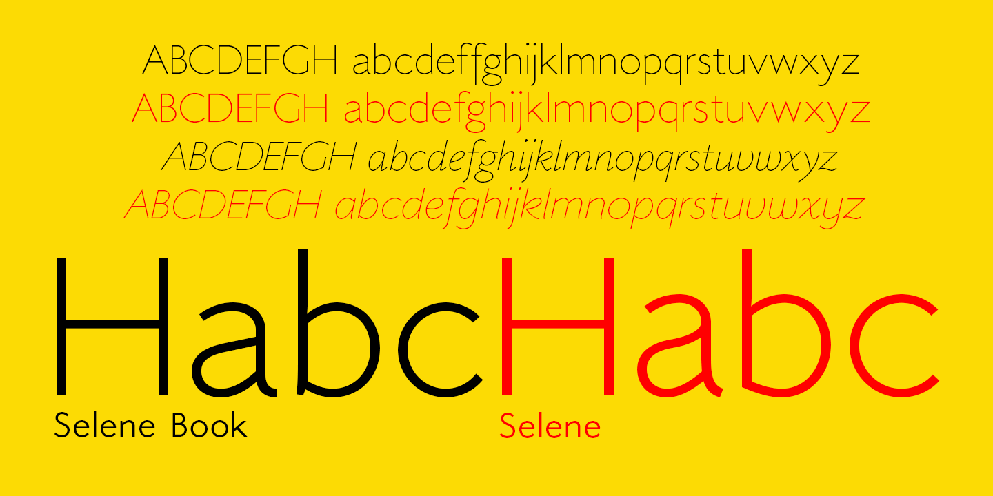
Comparison of the lowercase Latin of Selene with the Selene Book
The second change concerns the italics, again in the lowercase letters, completely redesigned to bring it closer to the typical chancery style that accompanies any of the modern Roman characters.

Overlapping some lowercase letters of the Selene (in red) with the Selene Book (in black)
The third and final change concerns the introduction of four new alternative styles of Latin capital letters (Selene had only one, the third), which start from the basic style, which follows the proportions of a Roman lapidary, passing through the art déco, the art nuveau, up to the modern and contemporary proportions.
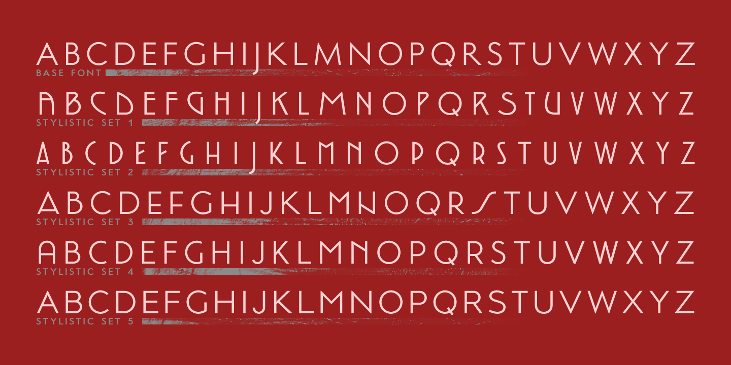
The alternative styles of Latin capital letters in the new font


