

Semplicità
After so many years, finally the famous Semplicità has been digitalized, and in all its variants: Light, Medium and Bold. Semplicità has been created by the prolific designer Alessandro Butti in 1930, for the Nebiolo foundry. My special thanks goes to: Romesh Naik (:Nike) that gave me hope to create this font from original catalogues scans.

The original font was provided in 12 styles, listed here from the Nebiolo catalog:
- 501-00 serie tonda chiara normale (light regular)
- 501-01 serie tonda chiara stretta (light condensed)
- 501-05 serie corsiva chiara normale (light italic)
- 501-06 serie corsiva chiara stretta (light italic condensed)
- 501-10 serie tonda neretta normale (medium)
- 501-11 serie tonda neretta stretta (medium condensed)
- 501-15 serie corsiva neretta normale (medium italic)
- 501-16 serie corsiva neretta stretta (medium italic condensed)
- 501-20 serie tonda nera normale (bold)
- 501-21 serie tonda nera stretta (bold condensed)
- 501-25 serie corsiva nera normale (bold italic)
- 501-26 serie corsiva nera stretta (bold italic condensed)
Digital reconstruction was modeled, where possible, from the body 28.
A bit of history
The commercial success of sans serif typefaces (Italian bastoni or senza grazie, U.S. Gothic, German Grotesk, French linéale) was probably due to the enormous development and widespread use of the press during the industrial revolution in the United Kingdom. Advertising, in particular, needing to attract the reader, had the necessity of to be written by a character that is legible and occupy as little space as possible, even when printed in large format. The san serif fonts, thanks to the almost constant thickness and the lack of serifes makes the letters more easily manipulated and adapted.
One of the first fonts of this type was engraved in 1816, with the name of Egyptian English, from Caslon foundry (see: Typophile: Two Lines English Egyptian). In 1896 Akzidenz Grotesk was produced by Berthold, from which will be born one of the most used characters of this type, the Helvetica designed by Max Miedinger for the Haas, Basel.

Construction of the capital G
As of the end of the first decade of the twentieth century, influenced by fashion, the sans serif fonts began to assume most simple geometric forms (consider, for example, the perfect circularity of O of the Johnston) and, between 1927 and 1930, Paul Renner designed Futura for Bauersche Giesserei in Frankfurt. Soon there was no printing press that could ignore this new type of character, mainly thanks to the use in the advertising graphics.
So there was developed the Kabel designed by Rudolf Koch for Klingspor in 1927, the Metro, designed by William Addison Dwiggins for the Mergenthaler Linotype Company in 1929, the Vogue for Intertype in the 1930s, Tempo designed by Robert Hunter Middleton for the Ludlow Foundry between 1930 and 1931, the Spartan by ATF in 1936 and finally the Twentieth Century designed by Sol Hess for the Lanston Monotype in 1937.
In Italy between 1930 and 1931 it was marketed by the Nebiolo foundry in Turin a rationalist character, in some ways very similar to Futura: the Semplicità (simplicity in Italian). But consider it a simple Italian reinterpretation of the Futura would be a mistake however: while the Futura is absolutely rational, the Simplicity still showing Liberty style influences, is simultaneously projected towards Art déco.
In an effort to make this character further multifaceted and versatile, it was modified in several versions including the Ombra (shadow in Italian) and a series of script uppercases, as it was the case for other similar fonts (such as was the case for other similar fonts like Tempo for example from which was derived the Umbra).

Semplicità Ombra (shadow)

Some capitals from Semplicità script
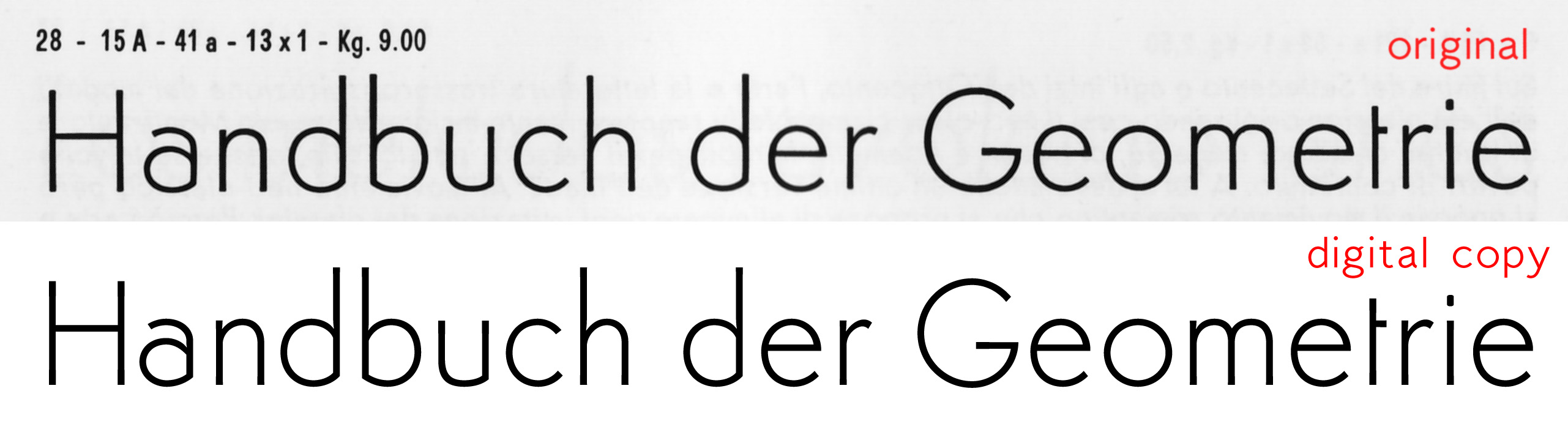
Comparison of the new font with the original
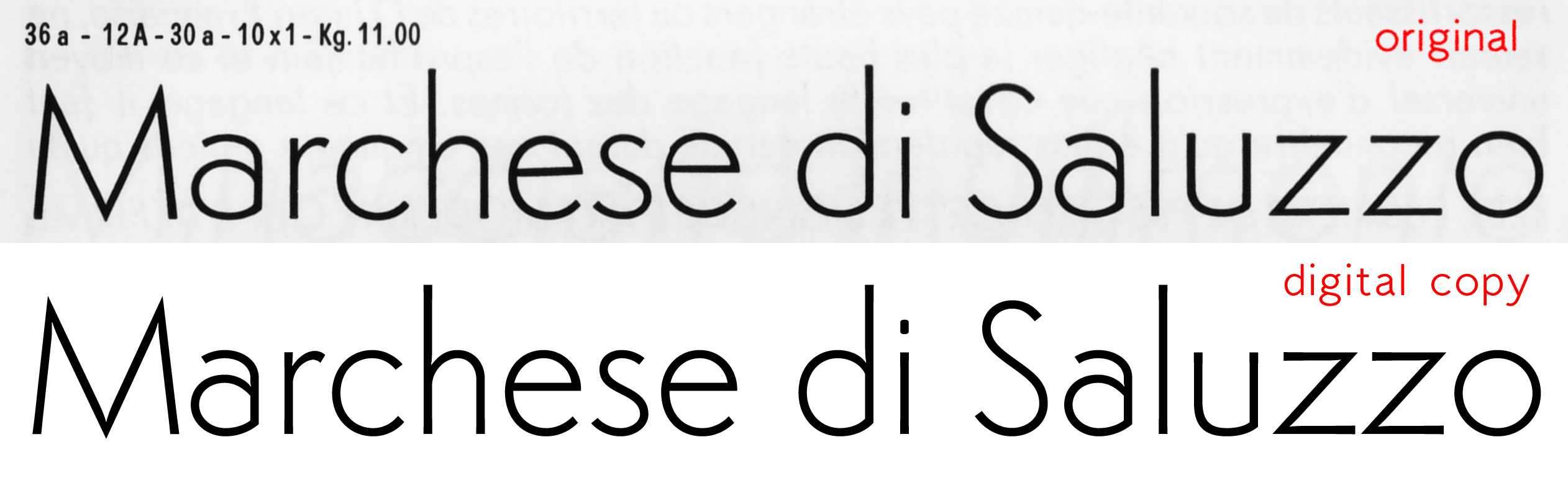
Comparison of the new font with the original
Semplicita.rar
File type: application/rar Download size: 279.10 KB Document type: OpenType Font Document version: 2.520 Document licence: Attribution-NoDerivs 3.0 Unported (CC BY-ND 3.0) Date added or updated: 21 December 2017 Download link: https://www.studiodilena.com/wp-content/uploads/2013/06/Semplicita.rarGlyphs deduced or added
Certain letters can not be copied from the original glyph, but it had to be deduce therefore, wholly or in part, its design:
- (U0022) – vertical double quote (not present in the original font)
- (U0022) – # (not present in the original font)
- (U0025) – percent
- (U0027) – vertical single quote (not present in the original font)
- (U002B) – plus
- (U002F) – slash
- (U003C) – less
- (U003D) – equal
- (U003E) – greater
- (U0040) – at (not present in the original font)
- (U005B) – open bracket
- (U005C) – back slash
- (U005D) – closed bracket
- (U005E) – ASCII circumflex (not present in the original font)
- (U005F) – underscore (not present in the original font)
- (U007B) – open brace
- (U007C) – bar
- (U007D) – closed brace
- (U007E) – ASCII tilde (not present in the original font)
- (U00A1) – inverse exclamation point
- (U00A2) – cent
- (U00A3) – Sterling
- (U00A4) – generic currency symbol (not present in the original font)
- (U00A5) – Yen (not present in the original font)
- (U00A6) – broken vertical bar (not present in the original font)
- (U00A9) – copyright (not present in the original font)
- (U00AA) – a superior
- (U00AC) – logico not (not present in the original font)
- (U00AF) – macron (not present in the original font)
- (U00B0) – degree
- (U00B1) – plus or minus (not present in the original font)
- (U00B2) – 2 superior (not present in the original font)
- (U00B3) – 3 superior (not present in the original font)
- (U00B5) – mi (not present in the original font)
- (U00B3) – paragraph (not present in the original font)
- (U00B7) – center period (not present in the original font)
- (U00B9) – one superior (not present in the original font)
- (U00BA) – o superior
- (U00BC) – one quarter
- (U00BD) – one half
- (U00BE) – three quarter
- (U00BF) – inverted question mark
- (U00D0) – Eth (not present in the original font)
- (U00D8) – Ø
- (U00DE) – Thorn (not present in the original font)
- (U00F8) – ø
- (U0138) – greenland k (not present in the original font)
- (U0141) – bar L (not present in the original font)
- (U0142) – bar l (not present in the original font)
- (U014A) – Eng (not present in the original font)
- (U014B) – eng (not present in the original font)
- (U0152) – Œ
- (U017F) – long s
- (U018F) – schva maiuscola (not present in the original font)
- (U0191) – tail F (not present in the original font)
- (U0192) – florin (not present in the original font)
- (U01B5) – bar Z
- (U01B6) – bar z
- (U01DD) – lowercase schva (not present in the original font)
- (U01DD) – dotless j (not present in the original font)
- (U0245) – turned V (not present in the original font)
- (U02D8) – breve and composites (not present in the original font)
- (U02DA) – ring and composites (not present in the original font)
- (U02DB) – ogonek and composites (not present in the original font)
- (U0311) – inverted breve and composites (not present in the original font)
- (U03B4) – lowercase delta (not present in the original font)
- (U03C0) – lowercase pi (not present in the original font)
- (U2013) – en dash (not present in the original font)
- (U2021) – double dagger
- (U2022) – bullet (found for the bold weight)
- (U2030) – per thousand (not present in the original font)
- (U20A4) – lira
- (U20AC) – Euro (not present in the original font)
- (U20AC) – TM (not present in the original font)
- (U03A9) -uppercase omega (not present in the original font)
- (U0394) – uppercase delta (not present in the original font)
- (U2212) – minus (not present in the original font)
- (UFB03) – legature ffi (not present in the original font)
- (UFB04) – legature ffl (not present in the original font)
- legature fj (not present in the original font)
- legature ffj (not present in the original font)
Useful links
fontshop.com – Short intro to geometric sans


