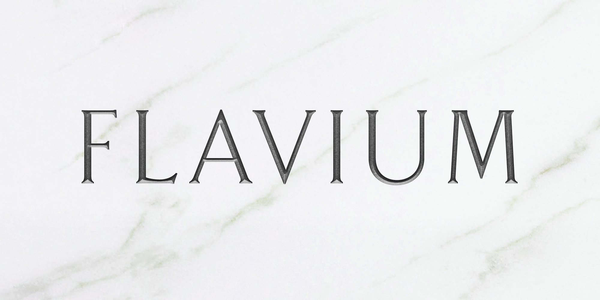

Flavium
The Flavium is the most faithful digital reconstruction of the Roman lapidary characters engraved on the marble plaques indicating toponymy and street numbering of the streets of Rome, precisely in the version in use from the late 1960s until the early 1990s.
The toponymic plates of Rome are made of white travertine, with little or not veins at all, and bear the entire title, in some cases combined with a brief description given below in smaller letters. Chiseled on the top right corner is shown the district to which the street belongs (municipality, zone, ward and others). Finally, the plaques are finished with a framed fillet.
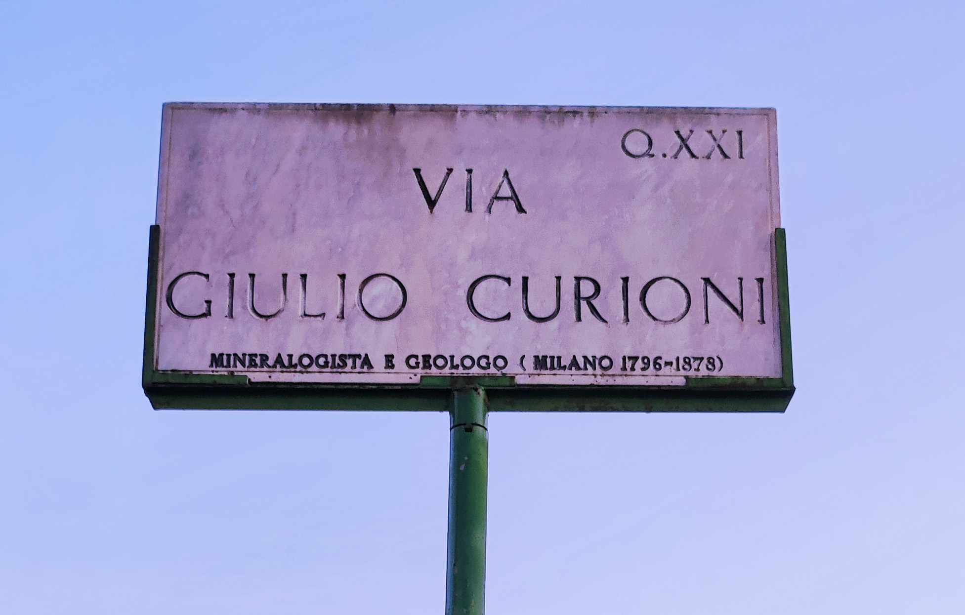
The typeface used is Roman lapidary, a type in use in Rome since ancient times. The Roman lapidary is a specialized typeface that was used in a variety of architectural and artistic applications, such as epigraphs, monumental buildings and stones in general. One of the most notable uses revolved around the creation of road signs, which were used to mark the boundaries of Roman territories and to provide information about important places along the roads.
The process of creating these plaques was highly sophisticated and laborious. Stonemasons would first select a suitable block of marble or stone, then carefully measure and trace the design for the text to be carved. Then, through the use of a variety of tools including chisels, hammers and drills, the sign was carefully carved into the stone. Once the carving was completed, the craftsman would carefully polish and smooth the surface of the marble or stone. The lapidary typeface, also known as serif font, is a typeface characterized by serifs, small transverse lines at the end of the strokes that make up letters and numbers.
The serifs in the typeface also helped make the signs more easily readable from a distance, which was especially important for drivers on the city’s busy streets. The classical and elegant appearance of the typeface is seen as a reflection of Rome’s rich history and cultural heritage.
Unfortunately, on the new street plaques we have recently witnessed the loss of manual engraving, carried out by the craftsmen, supplanted by mechanical engraving using commercial and particularly unsuitable typefaces such as Times New Roman (a beautiful Roman font, but certainly not lapidary in proportions and in conception) or the Palatino, a font that imitates the proportions of letters written on paper, certainly not stone engraving, where it appears awkward and dark.
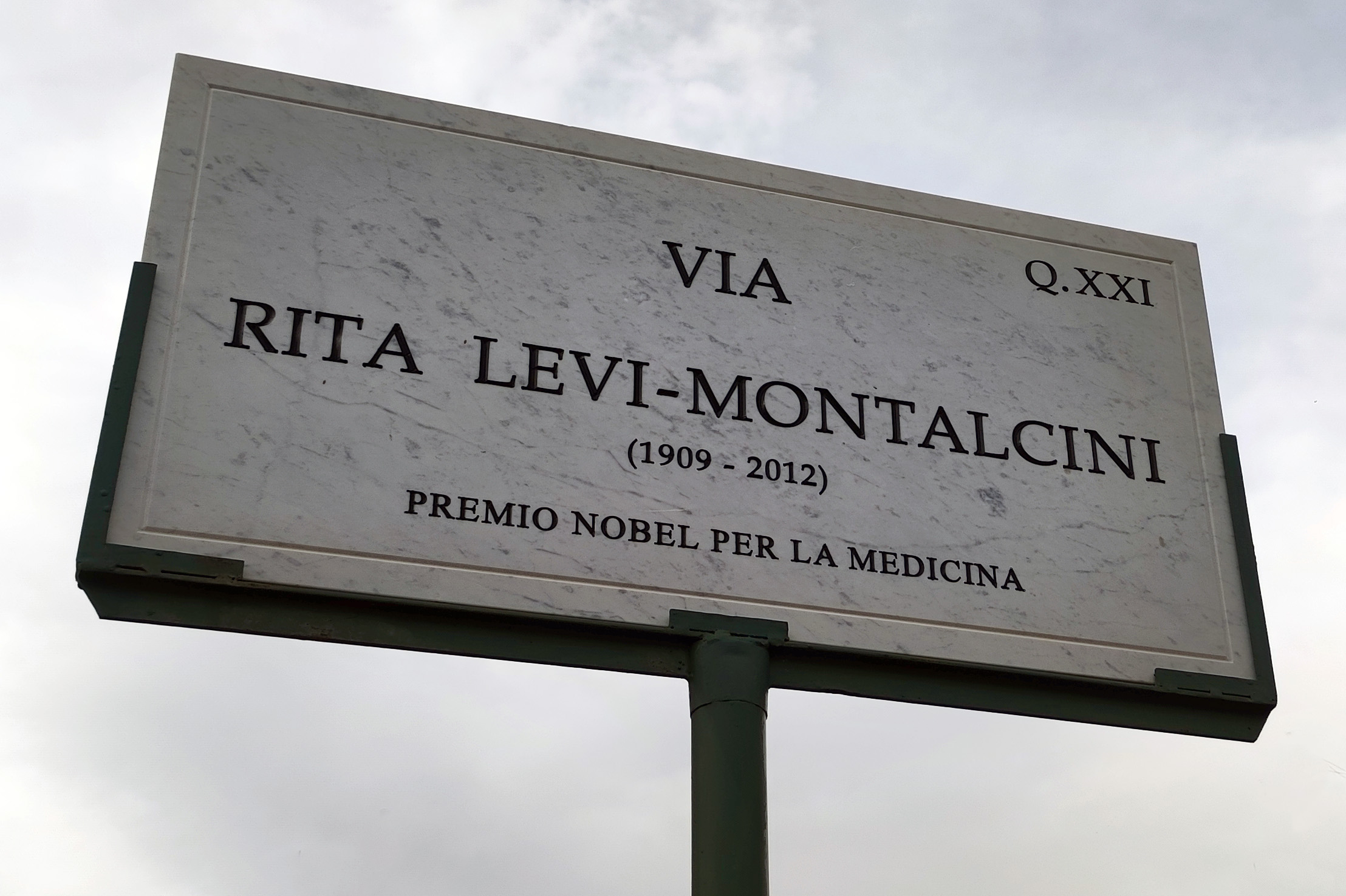
One of the new street signs designed using a modern typeface (Palatino)
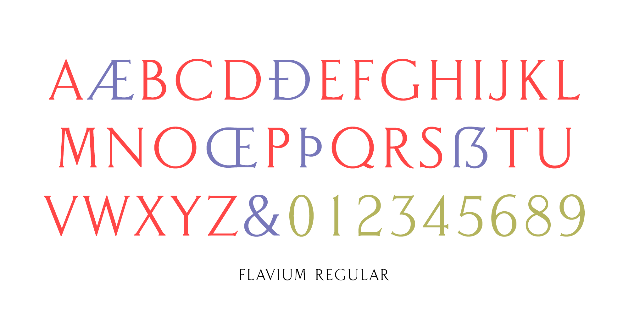
In contrast, this beautiful typeface was chosen for its legibility and durability, as well as its ability to convey a sense of history and tradition. This font is available on MyFonts in three different versions: the Regular, which shows the serifs as they are depicted by most of the street signs, the Full Serif, which presents more elongated serifs and finally the Sans Serif with slight flaring instead of the serifs.